1000°

N4G V2 Open Beta

It’s been a while now since we last had a major update to the site, 5 years to be exact. We are finally ready to push the next site update and we are aiming for a launch mid December. Before that we need some help with breaking stuff so we are opening up beta versions of all 5 newsboiler sites today so that we can do some stress testing and sort out the last bugs. So for those interested in helping out...

tayz3090d ago

I like the current design better.

ajax173090d ago (Edited 3090d ago )

The people have spoken! TABLOID VIEW SUCKS! Thanks for the bubbles, though. Sorry you guys took 5 years designing a site that nobody likes, lol.

mechlord3090d ago

thirded, fourthed and infinited. that layout suck balls. its just plain fugly. how could you even consider that??

uptownsoul3090d ago (Edited 3090d ago )

Everybody got 10 bubbles!!! ...except I already had exactly 10(so no upgrade or downgrade in bubbles for me). I noticed that some people said they got more bubbles, but did any get bubbles taken away?

RedDevils3090d ago

Same here the beta view look suck, don't fix what isn't broken!

Bansai3090d ago

Whoa, I really don't dig that layout, I hope we will be able to use the old skin.

AnubisG3090d ago (Edited 3090d ago )

Yeah, have to agree. The current design is just a lot better. Just want to add that I checked it out on my "mobile" and it's not great. So I think it's pretty clear that you guys are headed in the wrong direction with this new design. Wanted our feedback... Well, there you have it.

nix3090d ago (Edited 3090d ago )

35th'ed.

N4G, you already had that tabloid-like format for years but i've never used it. we like this format.

just bring back the Open Zone. Let's have some laugh in this site instead of depressing same fights every time... and also with Open Zone, Septic can finally open up to us. be who he really is. lol. i kid. i kid.

@AnubisG,

the mobile version is good the way it is.. please don't ask them to change that. last thing i want is another data consuming mobile site.

That-Guy3090d ago

Retain this layout please. Update it to be more reactive (scaling with size) if you want one theme to fit all (mobile). Perhaps update some of the colors and icons for a more modern look. Comments are far more legible here in the current version, and content is king. If it's harder to read there's less audience engagement.

JackBNimble3090d ago

Nope, if I am stuck with that tabloid shit I will never come back to N4G, sorry but it's garbage.

FriedGoat3090d ago

The problem with Tabloid view and any other design that features squares/pictures, is that there just isn't enough information on the screen, have to scroll down so far to get all the news :/

UltraNova3090d ago

Ok...I need some time to get used to this but I'll admit its quite slick

G20WLY3090d ago

Yep, sadly not a fan of the new layout. The thing is, by and large I like the current format fine, barring some fine tuning. I think the back end stuff needs tightening and the format is pretty clear as it is.

The new beta format is very odd. I don't understand why today's top story (about Sony's potentially unlocked 7th PS4 core) is 7 or 8 pages down?! And it's a little box, while stories with less than half the community interest have a box taking up over half the screen.

If anything, maybe look at the 'heat' level denoting the size of the box (up to full page width) as well as the order, otherwise gamers will miss important news if they only manage to steal seconds one day to glance at N4G.

Gazondaily3090d ago

You're honestly gonna lose a lot of engagement in that tabloid style layout. The one as it is is fine.

But still looking forward to the other changes minus that.

breakpad3090d ago (Edited 3090d ago )

@tayz while i like more the current one if they modify a bit the new one it would be the same...change the background color to blue ,add the same comment section as here , add some colors to add-agree and keep the flash and graphics at minimum so it can be fast even at low spec Pcs

ThanatosDMC3090d ago

That was horrible. It was like a bunch of ads from the usual $hitty websites.

Perjoss3089d ago

I even prefer current design (classic) when I'm browsing on a small phone or tablet, don't like this new one at all!

Major_Glitch3089d ago (Edited 3089d ago )

Yeah...the new layout is a no go.
Edit: Holy crap! Where did all these bubbles come from?!

AnubisG3089d ago

@nix

I meant to say the the new beta site design on mobile looks bad, not the current one. The current one is pretty good.

antz11043089d ago

Tabloid view is no good, it's just not fun to sift through on a tablet or a desktop. Keep it the same!

antz11043089d ago

If they wanted to do something right they would scrap the bubble system. Tabloid view is just annoying to sift through and now the threads are zoomed in way too close.

lociefer3089d ago

like some1 mentioned , pls also bring back the open zone section, some really funny stuff was going on there , we need to blow some steam every once in a while u no xD

subtenko3089d ago

Look, I think the layout is good, but the actual front page on the current layout looks better overall, the actual layout and possibly colors.

Everything else I think is slightly better.

The again I dont really dislike the current layout as well.

specialguest3089d ago

Wow, I've been an official N4G member for 9 1/2 yrs and a lurker even longer. I remember the first yr of N4G when the 2 separate Xbox and PS site merged to one. I also remember all of the updates which kept a similar layout making the site smoother and incrementally prettier.

However, with this latest update, its a drastic change. I dont like it, because each article post takes up an entire mobile phone screen of real estate. It makes scrolling passed each article post a pain. The current layout has always been mobile friendly, so why the drastic change?

amiga-man3089d ago (Edited 3089d ago )

Not for me, popped in then out again, if the site comes to that count me out.

ULTp0ltergeist3089d ago

Weeeeee free bubbles! ...i know off topic ;D

blackbeld3089d ago

The Beta looks pretty but tabloid sucks! The current view is clear so please don't change it.

Bathyj3089d ago (Edited 3089d ago )

Looks like the people have spoken. No one likes the beta layout. You have to look to hard to find information that used to just be there.

Also what's with all the bubbles? I earned my bubbles and it took years to get there. I also bite my tongue often so I don't lose them. NOW all the trolls have 10. I hope you going to reset that back to normal. Bring back the open zone if you want to give trolls free reign.

+ Show (24) more repliesLast reply 3089d ago
camel_toad3090d ago (Edited 3090d ago )

Just checked it myself and quickly closed the tab. I also like the current form. A vertical list is easier and faster to skim through than random fisher price-sized blocks.

Relientk773090d ago

Can they have the top 5 news stories on top, then the news under it like they do now. Then update everything else but keep the layout, The current "classic" layout is perfect

uth113090d ago

Don't like the look, but if the current bubble system is gone, I'll take it!

lociefer3090d ago

please listen to us and dont go tabloid , leave it as it is, its practical and easy to get the stories

babadivad3090d ago

I like the new design. It's a little cramped but not terrible. Just will take some getting used to.

iliimaster3090d ago

lol by then how many followers would this site have lost?

choujij3089d ago

Quite a few I would imagine.

fenome3090d ago

I definitely like the current design better myself, I've never been a fan of tile formats. The list is much easier for me to scan and see the things that interest me personally, I always have N4G set to Classic View..

-Foxtrot3090d ago (Edited 3090d ago )

Kind of reminds me of when Kotaku gave their site a new lick of paint

All we really needed was to scrap the bubbles.

Main criticism...it's too white. Sides are a faded grey and the main section for articles/comments are white

Can they not implement a colour/theme option.

Oh and the "SPAM/Inappropriate" options. I know there isn't any bubbles but shouldn't the options we had like immature, trolling, bad language remain so you know what kind of punishment to give out. Well maybe not bad language, that needs to be thought out more. If it's in the nasty way to a user then fine but if EA decides to do something stupid then I don't see why a "I don't f****** believe it" would be as bad. I've starred that out but you know what I mean, even if you are 12.

I just tested this on someone who wasn't in violation by the way, not because I'm a dick but because I thought clicking inappropriate would bring up some options but it didn't...sorry.

Little disappointing with how long it's been in development. I was expecting it to use 3D holograms or something at this point

TheCommentator3090d ago

Wait, you mean bubbles are finally going away?

G20WLY3090d ago

RIP bubbles. The system is only partially broken, since there are some people that nobody can listen to, regardless of preference. On that front it actually unites those of differing opinions.

Thanks for all the work on developing new solutions. Sorry it's not been well received, but at least the feedback should be invaluable to understanding what the community do and don't want.

Major_Glitch3089d ago

I would've liked the bubble system...if it worked properly.

+ Show (1) more replyLast reply 3089d ago
Export3090d ago

I like the reply system better

3090d ago
outsider16243090d ago

Agreed! I don't like the new layout. Maybe stick with the current layout but use different colors and different menu styles.

Ristul3090d ago

I dont want to shit on someones hard work but the new design is not great. When it comes to ui, simple is often better!

IanTH3090d ago (Edited 3090d ago )

Agree 100%. This has that PC Gamer typed layout that is infecting everything. Less intuitive to browse, things take up too much space, etc. They note that list view is coming, and I hope it comes with some improvements to the current list, but this would certainly be a no-go for me if it became their everyday interface.

Off Topic: You probably have more likes from this 6 word comment than I do in the history of my commenting lol.

rezzah3090d ago

I prefer the previous design, whatever that looked like.

I just remember liking it more than the current one.

TheSaint3090d ago

Seems like 99% of us like the old version better.

DOMination-3090d ago

I only use n4g on mobile so this update is very welcome. The current mobile site is very limited

Ahytys3090d ago

I don't like it at all! Useless change on a desktop PC

Clown_Syndr0me3090d ago

Agreed. New version on mobile is so crap can't find anything quickly.

Perjoss3090d ago

Don't change it, the layout of the current site (classic mode, not tabloid) is perfect.

bradleejones3090d ago

The current design is much better. If the new design was just laid over the current, then that would be great.

quaneylfc3090d ago

Have they removed the god-awful "agree, disagree" system?

Edito3089d ago

I'm with you, I think the actual website feels better.

3089d ago
SegaGamer3089d ago

What the hell is wrong with admins ? they always feel they need to change their site. Leave it as it is now, the new style is absolutely horrible.

UnHoly_One3089d ago

Yeah if this is the only option, I'm out. I hate literally everything about this layout. Even the comments section is terrible.

Thunder_G0d_Bane3089d ago

Agreed, the new design is terrible!!

SeanScythe3089d ago

Was anyone asking for the layout to change? No, so leave it alone. If it isn't broke don't fix it.

Spenok3089d ago (Edited 3089d ago )

The current design is definitely more comfortable, this new design is still nice. Personally I think the best part about the new design is the comments. It appears they got rid of the bubble system, which is super nice. I never dropped below the standard 5, but it's annoying when you're having a good conversation. I wish they would have added a button to respond to people regardless of where they were at on the comments section. It's annoying there's no way to notify them you've responded without some kind of tag or something. MANY other sites allow you to so you know when a conversation has continued without having to physically look at the thread to see if someone has responded. That is honestly my most requested feature.

N4G3RZ3089d ago

Design is not as good as the one on the OLD site.

FITgamer3089d ago

Agree. Not a fan of tabloid layout, also the overly white background is harsh on the eyes. Wonder without out the bubble system, will comment section end up like IGN's. Non-stop troll comments.

Silver_Faux3089d ago

It's safe to say that it's not gonna change any time soon...unless N4G pulls a Ubisoft/EA on us and tells us what we need

Silver_Faux3089d ago

What would be good if there was a 'filter' where you could set it so you won't see site you don't like come up on the news feed, ie Kotaku

3089d ago
Zhipp3089d ago

Yeah, the new design is too bright. Makes me feel queezy.

SynGamer3089d ago

Love the new design (same for animeshinbun.com as well)!

Erik73573089d ago

I think the newer one is nicer if your using a phone.

MehmetAlperTR3089d ago

i didnt like the Beta.. It's not nice.. I like the original one...

bradleejones3088d ago (Edited 3088d ago )

No sir, I don't like it.

crazyclown3087d ago

Same here, the new design is week and is actually way worse then mashable which is a similar design

+ Show (40) more repliesLast reply 3087d ago
Relientk773090d ago

"Site search is finally useful"

good lol

cplus3090d ago ShowReplies(2)
rkyounis3090d ago

I like the current design way better. The new one just looks disorganized and cluttered.

UserNameIsNotTaken3090d ago

It's like the Tabloid version of this site :/
Which I don't like.

Insomnia_843090d ago

That was horrible! Came back to the current version right away!

Show all comments (313)
120°

Microsoft's Absurd Antics Have Me Scared For Dishonored And Arkane Lyon's Future

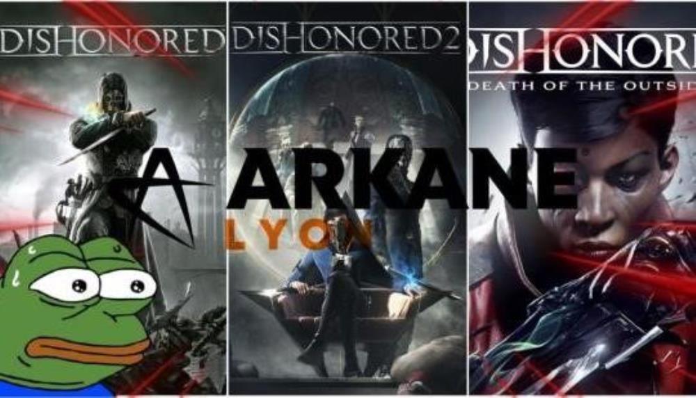
With Arkane Austin no more and Lyon living for who knows how long, the superb Dishonored is in serious danger; Microsoft cannot be trusted.

Relientk7712h ago

I love the Dishonored series so much and really want Dishonored 3. Microsoft better not screw this up.

JEECE9h ago

I mean, I think the fans will probably kill Arkane Lyon by cooking up reasons to hate whatever they do next without playing it. I've never seen a game so artificially disliked as Deathloop.

thesoftware7309h ago

Lol, why don't we just say, we are worried about all studios owned by MS now. They will keep closing studios until they have none left ...🙄

Skuletor6h ago

Just merge them all into a single studio, have it churn out a single Call of Duty every year and call it a day, lol.

Barlos6h ago

Don't be scared, you'll be fine.

Skuletor6h ago

It's exputer, fine is one word I would not associate with them.

Profchaos6h ago

I think it's becoming clear based on matt bootys comments there's no future for any IP that can't sell above 10 million within the launch window. But is also a small game that gives them prestige

/S it's beyond a joke right now

Show all comments (8)
180°

Xbox No Longer Has Its Head In The Game

Microsoft & Xbox have shut down Arkane Austin and Tango Gameworks to lay off more workers, insinuating that they're not in the game anymore.

XiNatsuDragnel2d ago

They're headless for a long time because closing tango isn't exactly a good move

PapaBop2d ago

Ever since that cringe Kinect reveal they've never been the same. They used to make some amazing games and do great deals with third parties Early on in the 360 era they had games like Chromehounds and Shadowrun, both well ahead of their time. Now instead of nurturing their studios, they'd rather gaslight gamers and throw billions on pre existing studios. Not sure how Spencer is still in a job, I wouldn't trust him to organise a piss-up in a brewery.

Father__Merrin1d 23h ago

We've said all along Spencer needs to go. I wish xbox went back to xbox only with new gears fable forza halo releases lots of third party releases

Those early rainbow 6 Vegas days and phantasy star universe are gone forever

S2Killinit1d 21h ago

MS has its head in the game but the game they are playing is something different from what console gamers expect from a platform. MS’s end game has always been to use the xbox as a trojan horse.

XiNatsuDragnel1d 18h ago

Lol that's funny well this plan they have isn't working homie

1Victor2d ago

“Acquisitions always come with cuts”

343 trillion points shield activated
343 trillion percent damage negate activated
All damage reduced to 1 for 343 trillion turns.
MICROSOFT DEFENSE FORCE IS A GO

Tacoboto2d ago

Especially for Microsoft, when Booty pretty much said they didn't know how to handle that many studios.

Why even make the acquisition then.

-Foxtrot2d ago

Didn’t they make the swipe for Bethesda when Sony wanted like 6 months exclusiveness for Starfield

It’s like…chill, you got Rise of the Tomb Raider for a year.

romulus232d ago

Do they always come with senseless cuts becasue that's exactly what cutting Tango was, senseless.

H92d ago

Everyone's acting now that game companies care about games and Xbox is committing the Ultimate betrayal, they are all like this and you have just been quiet about it for far too long

Nuclearmoon2d ago

I wonder if Microsoft do pull out of the console market that it might open the door for valve to relaunch the Steambox. Competition is good for the industry but Microsoft don't even seem to be trying anymore.

UltimateOwnage2d ago

Steam / Valve are one of the few truly pro-consumer bright spots in gaming right now. Thankfully.

Jingsing1d ago

From all the money Valve make from Steam they reinvest almost 0 into creating new AAA titles for the PC platform, Absolutely no giving nothing back in that regard. Wake up.

jwillj2k42d ago (Edited 2d ago )

“Your game has won some pretty significant awards and is a show piece for where we want to go in the future.”

1 hour later.

“We’re gonna have to let you go. You can’t cover our 100 billion dollar acquisition. Oh and take your awards too 👍🏾”

Show all comments (30)
70°

Sega's Profits Are Up, But It's Mostly Down To Pachislots

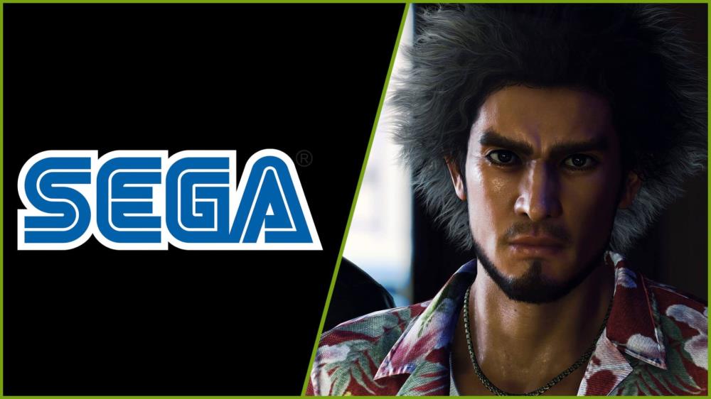
Sega has released its financial statement for the 2023-24 fiscal year, and profits may be up, but it's mostly not down to video games.

Read Full Story >>
techraptor.net